Wireframing: A Comprehensive Guide
If you’ve dipped your toes into the fascinating field of UX design, you’ve likely heard the word ‘wireframes’ tossed around. Wireframing is a crucial part of the product design process—but what actually are wireframes, and why are they important?
In this blog post, we’ll take you through everything you need to know about wireframes. We’ll start off by dissecting the anatomy of a wireframe—from what it is, to where it fits into the product design process, to what features are included within one. We’ll then take a look at the different types of wireframes, what tools are required to build them, and finish off with some wireframing examples to showcase their versatility. By the end of this blog post, you’ll be taken from wireframing novice to bona fide expert!
Already overwhelmed? Don’t worry: if you want to skip to a specific section, clicking on the relevant heading below will take you straight there.
Here’s what we’ll cover:
- What is a wireframe and who uses them?
- When does wireframing take place?
- What is the purpose of wireframing?
- What is included in a wireframe?
- Examples of wireframes
- Conclusion
Ready to lift the lid on the wonderful world of wireframes? Off we go!
What is a wireframe and who uses them?
Let’s start with the obvious question: what is a wireframe?
Not dissimilar to an architectural blueprint, a wireframe is a two-dimensional skeletal outline of a webpage or app. Wireframes provide a clear overview of the page structure, layout, information architecture, user flow, functionality, and intended behaviors. As a wireframe usually represents the initial product concept, styling, color, and graphics are kept to a minimum. Wireframes can be drawn by hand or created digitally, depending on how much detail is required.
Wireframing is a practice most commonly used by UX designers. This process allows all stakeholders to agree on where the information will be placed before the developers build the interface out with code.
Want to know how to create a wireframe? Check out our video below, where CareerFoundry’s UX Designer Jeff Humble presents the ultimate beginner’s guide to wireframing.
When does wireframing take place?
The wireframing process tends to take place during the exploratory phase of the product life cycle. During this phase, the designers are testing the scope of the product, collaborating on ideas, and identifying business requirements. A wireframe is usually the initial iteration of a webpage, used as a jumping-off point for the product’s design. Armed with the valuable insights gathered from the user feedback, designers can build on the next, more detailed iteration of the product’s design—such as the prototype or mockup.
What is the purpose of wireframing?
Wireframes serve three key purposes:
Wireframes keep the concept user-focused
Wireframes are effectively used as communication devices; they facilitate feedback from the users, instigate conversations with the stakeholders, and generate ideas between the designers. Conducting user testing during the early wireframing stage allows the designer to harbor honest feedback, and identify key pain points that help to establish and develop the product concept.
Wireframing is the perfect way for the designers to gauge how the user would interact with the interface. By using devices such as Lorem Ipsum, a pseudo-Latin text that acts as a placeholder for future content, designers can prompt users with questions like “what would you expect would be written here?”. These insights help the designer to understand what feels intuitive for the user, and create products that are comfortable and easy to use.
Wireframes clarify and define website features
When communicating your ideas to clients, they may not have the technical lexicon to keep up with terms like “hero image” or “call to action.” Wireframing specific features will clearly communicate to your clients how they’ll function and what purpose they’ll serve. Wireframing enables all stakeholders to gauge how much space will need to be allocated for each feature, connect the site’s information architecture to its visual design, and clarify the page’s functionality.
Seeing the features on a wireframe will also allow you to visualize how they all work together—and may even prompt you to decide to remove a few if you feel they’re not quite working with the rest of the page’s elements. The wireframing stage is when stakeholders can be brutal!
Wireframes are quick and cheap to create
The best part about wireframes? They’re incredibly cheap and easy to create. In fact, if you have a pen and paper to hand, you can quickly sketch out a wireframe without spending a penny. The abundance of tools available means you can also build a digital wireframe within minutes (we’ll talk more about that a little later on!).
Often, when a product seems too polished, the user is less likely to be honest about their first impressions. But by exposing the very core of the page layout, flaws and pain points can easily be identified and rectified without any significant expenditure of time or money. The later it gets in the product design process, the harder it is to make changes!
What are the different types of wireframes?
There are three main types of wireframes: low-fidelity wireframes, mid-fidelity wireframes, and high-fidelity wireframes. The most significant distinguishing factor between these wireframes is the amount of detail they contain.
Let’s look at these more closely:
Low-fidelity wireframes
Low-fidelity wireframes are basic visual representations of the webpage and usually serve as the design’s starting point. As such, they tend to be fairly rough, created without any sense of scale, grid, or pixel-accuracy. Low-fidelity wireframes omit any detail that could potentially be a distraction and include only simplistic images, block shapes, and mock content—such as filler text for labels and headings.

Low fidelity wireframes are useful for starting conversations, deciding on navigation layout, and mapping the user flow. In short, low-fidelity wireframes are ideal if you’ve got stakeholders or clients in the room and you want to sketch something up with a pen mid-meeting. They’re also incredibly useful for designers who have multiple product concepts and want to quickly decide which direction to go down.
Mid-fidelity wireframes
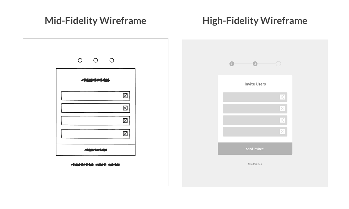
The most commonly used wireframe of the three, mid-fidelity wireframes feature more accurate representations of the layout. While they still avoid distractions such as images or typography, more detail is assigned to specific components, and features are clearly differentiated from each other. Varying text weights might also be used to separate headings and body content. Though still black and white, designers can use different shades of grey to communicate the visual prominence of individual elements. Although they are still relevant in a product’s early stages, mid-fidelity wireframes are usually created using a digital wireframing tool, such as Sketch or Balsamiq.
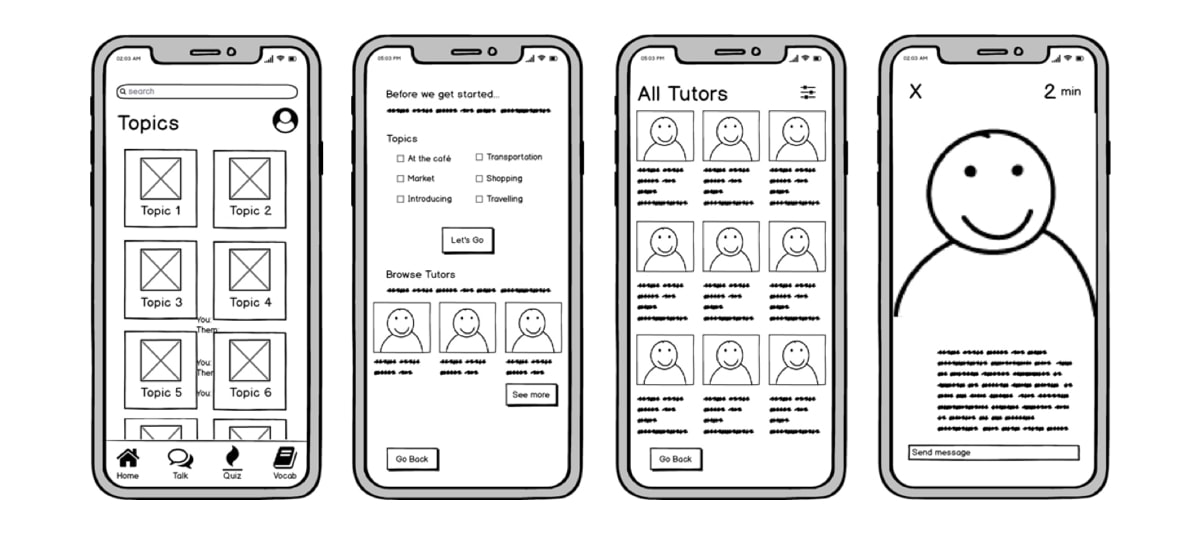
Source:Katherine Lu’s portfolio
High-fidelity wireframes
Finally, high-fidelity wireframes boast pixel-specific layouts. Where a low-fidelity wireframe may include pseudo-Latin text fillers and grey boxes filled in with an ‘X’ to indicate an image, high-fidelity wireframes may include actual featured images and relevant written content. This added detail makes high-fidelity wireframes ideal for exploring and documenting complex concepts such as menu systems or interactive maps.
High-fidelity wireframes should be saved for the latter stages of the product’s design cycle. These can be created in tools like Figma
What is included in a wireframe?
As we touched on earlier, how many features are included in a wireframe depends largely on whether the wireframe is low, mid or high fidelity. However, elements that are typically found in wireframes include logos, search fields, headers, share buttons, and pseudo-Latin (Lorem Ipsum) placeholder text. High-fidelity wireframes may also include navigation systems, contact information, and footers. Typography and imagery should not be part of a low or mid-fidelity wireframe—but designers often play with the sizing of the text to represent the information hierarchy or indicate a header.
Wireframes are traditionally created in greyscale, so designers often play around with shading—using lighter shades of grey to represent light colors, and darker shading to represent bolder colors. In high-fidelity wireframes, designers may throw in the occasional color; such as red to indicate a warning or error message, or dark blue to represent an active link. As wireframes are two-dimensional, it’s important to bear in mind that they don’t do well with showing interactive features of the interface like drop-downs, hover states, or accordions that implement show-hide functionality.
Website wireframes vs. mobile wireframes
When we think of wireframes, we often cast our minds to desktop website wireframes. But mobile wireframes require special considerations. So what are the core differences between the two?
Size
Due to the size differences between mobile apps and desktop websites, layouts have to be thought about very carefully. Due to the screen width on a desktop website, for example, your website wireframe might feature a layout that spreads over multiple columns. On a mobile app, the number of columns is usually restricted to one or two columns maximum. You’ll need to decide whether they see an infinite scroll, or whether you want to decrease the number of items per page in order to display other content beneath.
Behaviour
The second core difference is the behavior of the mobile app or website. On a website, the user will use a mouse or trackpad to navigate the page. The user can also click on certain features to reveal additional pieces of information, or even hover over certain interactions to reveal menus. On a mobile app, however, users will have to tap the screen to open a feature. When wireframing for mobile apps, this means thinking more carefully about how you will encourage your users to tap a specific button to reach a specific goal.
Interaction
The way that users interact with mobile apps differs vastly from how they interact on a desktop. The app may pull content and data from the Internet in a similar fashion to a website, but many apps also offer the user the option to download content for offline use. These “offline modes” specific to mobile applications should be reflected in your wireframe.
Examples of wireframes
To give you an idea of the variety of ways wireframes can be created (and to provide you with some well-needed inspiration for your own wireframes) let’s take a look at some wireframing examples:
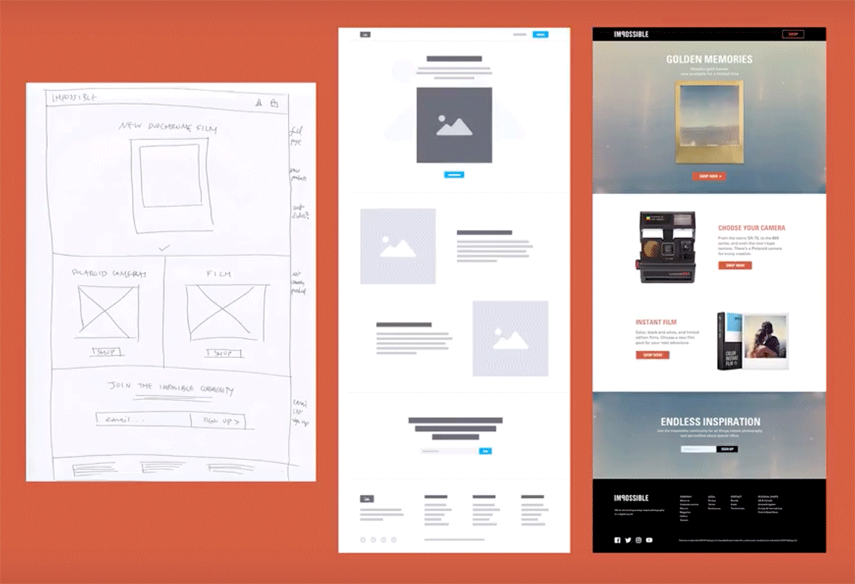
Monica Galvan shows us the transition from low-fidelity wireframe to high-fidelity wireframe, right through to the final UI for her Impossible project.
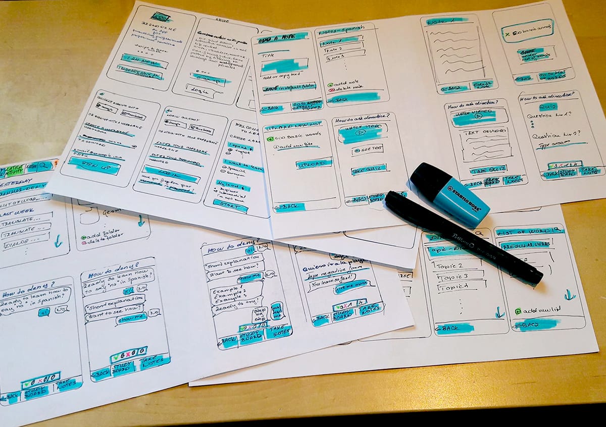
Elvira Hellenpart’s wireframes for the VocabApp project, created as part of the CareerFoundry UX Fundamentals Program.
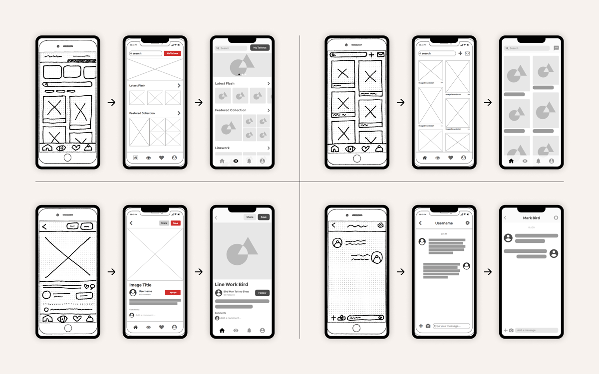
“Starting with low-fidelity ink-on-paper wireframes and a mobile-first design approach, I began to iterate my way to a higher-fidelity prototype” says UX alumnus Aaron Akbari Mort about his Inktank project.
Conclusion
So there we have it: everything you need to know (and then some) about wireframes. They may seem basic enough to be overlooked, but wireframes will enable you to get vital user, client, and stakeholder approval when it comes to the layout and navigation of the product’s key pages. Armed with this approval, you can move forward with the confidence that you’re designing something that your clients and users will love. The bonus? Wireframes save heaps of time and money in the long run!
Hannah, Jaye. What Exactly Is Wireframing? A Comprehensive Guide. careerfoundry.com/en/blog/ux-design/what-is-a-wireframe-guide/.